Mapping Australia’s Electorates
Nathaniel Tomasetti, Di Cook, Heike Hofmann and Jeremy Forbes
2023-04-26
Source:vignettes/plotting-electorates.Rmd
plotting-electorates.RmdThis vignette describes how to make a map of the Australian election
results. It requires merging polygons of the electoral regions, with
election results using the electorate id’s or unique names. The
nat_map16 contains the electorate polygons and
fp16 contains the results of the 2016 Federal election.
nat_map16 must be loaded using
nat_map_download.
There are state-specific pseudonyms for the Liberal-National Party coalition, and for illustration purposes these are grouped into one category we will call “Liberal National Coalition”. These political groups are set colours that roughly match their party colours.
# Grouping different Lib/Nats togethers
map.winners$PartyNm <- as.character(map.winners$PartyNm)
map.winners <- map.winners %>%
  mutate(PartyNm = ifelse(PartyNm %in% c("LIBERAL PARTY", "NATIONAL PARTY"), "LIB/NATS COALITION", PartyNm)) %>%
  arrange(group, order)

# Colour cells to match that parties colours
# Order = Australian Labor Party, Independent, Katters, Lib/Nats Coalition, Palmer, The Greens
partycolours = c("#FF0033", "#000000", "#CC3300", "#0066CC", "#FFFF00", "#009900")
library(ggthemes)
ggplot(data=map.winners) +
  geom_polygon(aes(x=long, y=lat, group=group, fill=PartyNm)) +
  scale_fill_manual(name="Political Party", values=partycolours) +
  theme_map() + coord_equal() + theme(legend.position="bottom")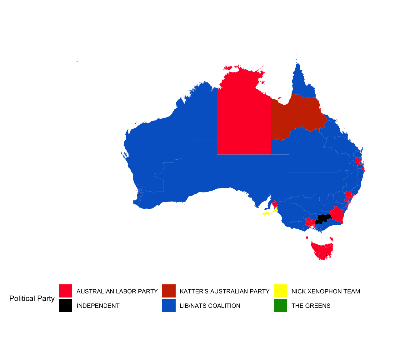
However, the Australian electoral map is not conducive to chloropleth map, because most of the population concentrate in the five big cities, Sydney, Melbourne, Brisbane, Adelaide and Perth, which means that there are lot of very geographical tiny regions that contribute substantially to the house of representative composition. A better approach would be to use a cartogram to display the election results, which would maintain the geographic location but make the sizes of the electorate polygons approximately equal. This is very hard to perfect for Australia because the size differential between electorates is huge, resulting in a cartogram where all sense of geography is demolished.
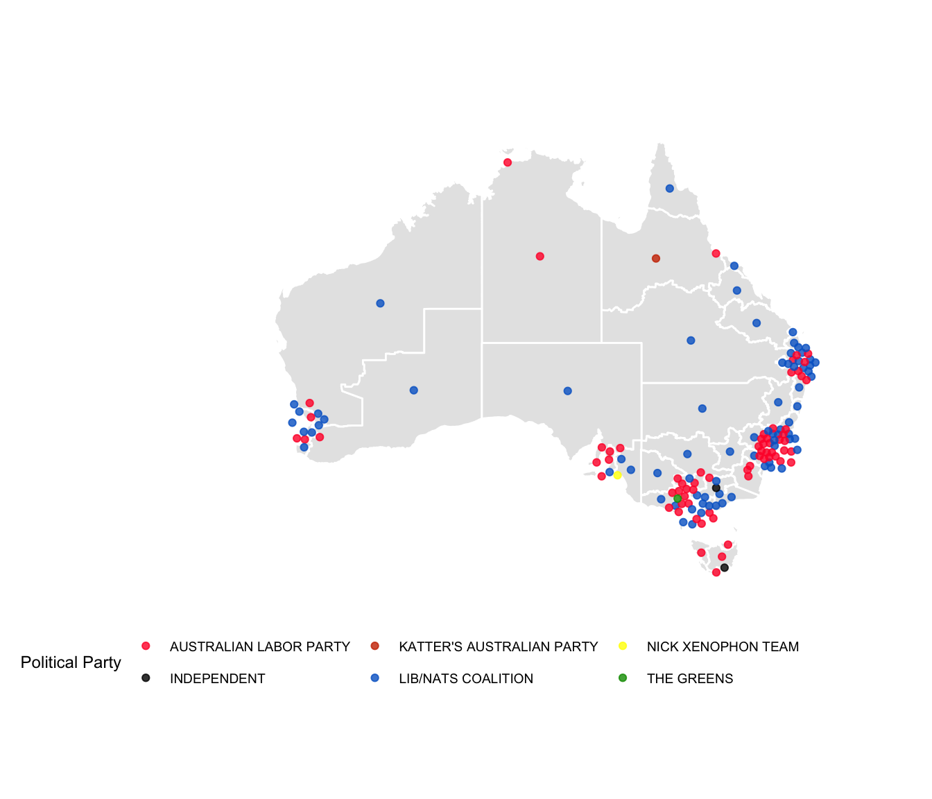
A compromise is to use a non-contiguous, dorling cartogram, and
represent each electorate with a circle, approximately in the geographic
center of each electorate, with an underlying map. The major population
centers need to have their center locations ballooned to make this
feasible visually. This is achieved by extracting the electorates for
each of the population centers, exploding the geographic center
locations using the dorling algorithm, and then pasting them back into
the landscale of all the electorates, using the
aec_add_carto_f function in the package (or step by step
with the aec_extract_f, aec_carto_f and the
aec_carto_join_f functions). The resultant coordinates for
each election are saved in the nat_data01,
nat_data04 etc. datasets distributed with the package, they
are labelled x and y. This data is used to
create the display of electoral results below.
# Load election results
cart.winners <- fp16 %>%
  filter(Elected == "Y") %>%
  select(DivisionNm, PartyNm) %>%
  mutate(PartyNm = ifelse(PartyNm %in% c("LIBERAL PARTY", "NATIONAL PARTY"), "LIB/NATS COALITION", PartyNm)) %>%
  merge(nat_data16, by.x="DivisionNm", by.y="elect_div")

# Plot it
ggplot(data=nat_map16) +
  geom_polygon(aes(x=long, y=lat, group=group, order=order),
               fill="grey90", colour="white") +
  geom_point(data=cart.winners, aes(x=x, y=y, colour=PartyNm), size=1.5, alpha=0.8) +
  scale_colour_manual(name="Political Party", values=partycolours) +
  theme_map() + coord_equal() + theme(legend.position="bottom")